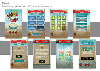
With the result screen and in-game tutorial I can finally make up my mind on the generic text frame: beige is fitting well.
The victory (or defeat) scroll is standing out too much, I will have to find something more neutral like a pattern or a brush stroke.
Now the HUD:
I use the usual lacquered boxes for the pause and melt icons, and I find out that the blue background color is too similar to the fish can icon. Information must stand out and it's time to test different colors! Maybe the red background that I so hardly try to use will match?! There's something to dig there :D
Tiles:
Well I worked a lot on those tiles with Tuesday Quest two years ago. We had to find the right size, angle, depth and pattern (a sardine can ^^) to make the game fun to play on small screens. For Pingouin & Raptor I wanted toy-like colorful bright plastic tiles. I used one of my very first tile test to get the new version. And then I quickly draw a few different sets of Pingouin & Raptor for the mock-up.
In the end I have the whole set of screens ready, a few improvements and I will be able to start the UI assets production.
Next: backgrounds and a lot of cute Pingouin & Raptor ^^


No comments:
Post a Comment